|
A fun edit is to create color splash affect. Watch clear tutorial how to accomplish color splash.
Here are my notes, which make much more sense when you watch the tutorial. a.Filters, Black and White; then neutral b.Tools: mask, Wipe, Pinch image to zoom in; with finger wipe away B & W affect; touch or dab with finger rather than wipe; c.Apply button d.Image; Adjust; Clean; slide left or right on screen to photoshop e.Then clarity filter, then denoise filter, drag up to make fake view f.Click button on lower right to see previous look g.Filters: analogue; then apply fuji, drag up for good color splash affect and gets rid of edges that bled through
0 Comments
Editing your iphone photos is a blast. A terrific app is Enlight. LInk here for a tutorial Enlight Iphone App Full Walk Through to get a helpful overview of all the useful options. 2015
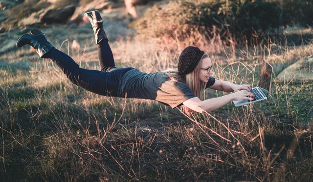
"Enlight is best used in landscape mode, unlike Darkroom and VSCO (neither of which give you the option) — you swipe from the left to access your tools, and from the right to choose which photo you're editing. And Enlight does a great job of helping you see where you're at in the process. At the bottom you can go back and forward between changes you've made, and there's another button you can press to get a quick glimpse of the original, pre-edit image. You can also pinch to zoom in to the pixel level with no apparent quality loss, which is a big improvement over both VSCO and Darkroom. Heavy editing of smartphone JPEGs can degrade image quality pretty fast, so it's useful to be able to check how the file is holding up. ENLIGHT IS A SLICK PHOTO-EDITING MULTI-TOOL Once you've gotten used to the interface, you'll find a ton of tools to play with. Like Darkroom, you have full access to your camera roll without having to import files to the app itself. There are pretty advanced cropping, perspective, and refitting options for altering the photo's framing, and features like text, tilt-shift, and Instagram-ready resizing are as robust as what many dedicated apps offer. Enlight even lets you edit using curves." from The Verge This week's assignment in 52 Week Challenge was to post a levitation photo. Ian Norman started a website called The Photon Collective, and he posted these instructions and video to explain the technique. You can use the jump method and hope you or model doesn't get injured. Or you can use a tripod, a stool, a digital camera, and then edit in photoshop using layers.
Watch Mike Browne take the same shot of a young woman in street changing the focal length but keeping the same composition. Also includes rest of article from The Camera Forum.
There are basically two different ways to use a zoom lens. Most beginners use a zoom as a composition creation tool. Used in this manner, the photographer selects a position to stand relative to the subject, then adjusts the focal length until satisfied with the composition. While this method does work, it doesn’t always end up providing the best overall look for your finished photo, particularly in the way the background renders behind your subject. Frequently, especially with cameras that use APS-C or M43 sensors, your background has too much depth of focus and you see way too much distracting detail in the background. Some photographers shoot full frame sensors particularly to attain this shallow depth of field effect. The second way to use a zoom lens is to picture it as nothing more but a compact collection of prime lenses of different focal lengths all packed into one. As Mike Browne does a wonderful job demonstrating in his piece above, when viewed from this perspective whole new worlds open up. A common zoom now becomes a powerful creative tool when used properly. It’s all in the perspective of the photographer. The way you get your head around it. Remarkably helpful Iphone Photography taught by Emil Pakarklis I want to add taking strong iphone photos to my photography skills. I am finding clear explanations, strong examples, and helpful tips from Emil Pakarklis. I highly recommend his his iphone photography course. He explains skills such as: 1. Ways to hold camera 2. Quick ways to open camera and different ways to release shutter 3. Setting focus and exposure 4. Burst mode 5. Using HDR (high dynamic range) 6. Panorama photos 7. Finding best angle 8. Rules of Composition (rule of thirds, direction of movement, negative space, symmetry, leading lines, patterns, diagonal principle) 9. Light 10. Story-telling 11. Silouhettes 12. Reflections 13. Shadows   LOOP LIGHTING FOR PORTRAIT PHOTOGRAPHY
BY DANNY EITREIM In portrait photography, this lighting pattern tends to be one of the most popular. It is easy to set up and is flattering to most subjects’ facial types. Remember that it is shadow that defines form in a photograph. This is such a key concept, we even name all of the various lighting patterns by the shadows they create! While we always have to think about the light in photography–never forget the shadows! In a “loop lighting” pattern, we adjust our light so that the shadow of the nose shows up on–and forms a little loop upon–the subject’s cheek, traveling down as far as the corner of the subject’s mouth. In loop lighting, we want a slightly downward angled shadow (not too much) so we raise the light slightly above eye level. We want the end of the nose to cast a rounded–looped–shadow down from the nose to around the corner of the mouth or even a bit shorter. The shadow goes off to the side; it is not directly under the nose. The area between the upper lip and the nose remains unshadowed. Of course, shadows are cast directly opposite from the light, so to get a shadow going to the side and down, we need a light positioned on the opposite side and up. Start with the light off to the side at approximately 45 degrees from the camera. Then tweak and adjust from there. Depending on the subject’s face, the best angle may be a bit more or less than 45 degrees. Pose your model. Set your light a bit above eye level, move it to about 45 degrees to the camera, and see where the shadow from the nose falls. If needed, move the light up and down and side to side until you get the desired shadow shape. Depending on the shape of your model’s face and nose, this adjustment could go from 45 degrees to as little as 30 degrees. Or in some cases it could even go past 45 degrees. Keep in mind that you want to keep this shadow small. The light should travel down the nose (with the opposing shadow between the nose and cheek) and continue from the bottom of the nose creating a loop-shaped shadow running toward the corner of the mouth. This lighting pattern is good for people with oval-shaped faces. Because of the downward sloping angle of the “loop” it will visually lengthen the face a bit. And, to a lesser extent, it can give the appearance of slightly higher cheekbones. What is the Adjustment Brush Tool?The Adjustment Brush in Lightroom is a tool that allows you to make adjustment to only certain areas of an image by “painting” the adjustment on where you want it. As you know, in the Develop module you adjust the sliders in the Right-hand panel to make adjustments to the entire image. However, by using the Adjustment Brush, you can make selective adjustments to only the areas of the image that you choose.
How to use the Adjustment Brush Tool? free tutorial from Cole's Classroom. This is easy to understand tutorial providing clear explanations of the Adjustment Brush Tool. There is a clear video in addition to written instructions. Information cover is on 1. Presets (free and from web - pay) 2. Brush Options and Tools 3. Using The Adjustment Tool 4. Brush with Color 5. Change Size of Brush 6. Erase Tool Jim Zuckerman on Composition: Leading Lines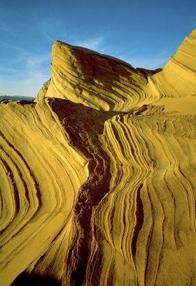 Photo by Jim Zuckerman 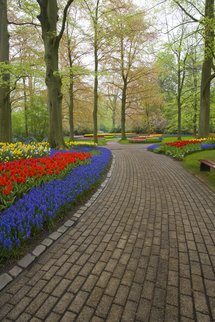 Photo by Jim Zuckerman "One of the things that make a photograph successful is that it directs attention to the subject. This can be done with good lighting, muted backgrounds, or graphic design. An important design element that directs our attention into the heart of a picture is called a leading line. This is a line that usually begins at the bottom of the composition and extends into the heart of the scene, bringing with it our eye. This line can take many forms. It can be railroad tracks, a line of colorful flowers, a split-rail fence, a gravel road, and many other things. See entire article with corresponding photographs Distant Draw The rows of tulips in figure 2.1 presented me with dramatic and colorful leading lines when I was in Holland, and the striations in sandstone and the boldly defined shadow seen in 2.2 that I found in southern Utah do the same thing. They draw our eyes into the distance or into the heart of the picture in a very engaging and artistic way. In a very different way, the gravel road in Cades Cove in the Great Smoky Mountains (2.3) visually pulls us into the distance. In this case, the line starts from the lower right corner instead of the lower middle portion of the image, but the effect is the same. Line and Depth of Field When you compose a picture such that it has a defined leading line, I feel it’s important that you have complete depth of field. The foreground portion of the line should not be soft, and similarly, the background should be sharply defined. That only makes sense, since the point of the leading line is to direct our attention to the subjects in the distance, and what’s the purpose of doing so if those subjects are not sharp? Therefore, you should choose small lens apertures in the f/16-to-f/32 range, and that will almost always require a tripod. The reduced size of the aperture means that the amount of light is less, and therefore to maintain the same correct exposure the shutter has to be open longer. A longer shutter speed means that you will take a blurred picture unless is the camera is motionless during the exposure. And that, in turn, means that a tripod is essential. If there is any wind, long shutter speeds will make this a challenge, however. When I shot the stunning flowers in Keukenhof Gardens near Amsterdam (2.4), I had to wait for a lull in the wind to render the flowers on the left tack sharp. This was one of the most compelling leading line photographs I’ve taken, because not only is the graphic design strong but the colors are outrageous. Line and Light One of the things I look for in seeking out leading lines is distinctive lighting. Light versus dark, streaks of moving lights, and long shadows can create distinctive foregrounds. Tail lights, for example, make beautiful leading lines at night as you can see in this photo (2.5) taken in Los Angeles. In this case, the lines are diagonal, which adds another dynamic compositional element."  Photo by Jim Zuckerman  Photo by Jim Zuckerman 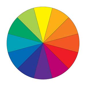 A favorite of designers and artists, the wheel makes color relationships easy to see by dividing the spectrum into 12 basic hues: three primary colors, three secondaries, and six tertiaries. Primary colors are red, blue, and yellow. These colors are pure -- you can't create them from other colors, and all other colors are created from them. Secondary colors are orange, green, and violet. They line up between the primaries on the color wheel because they are formed when equal parts of two primary colors are combined. Tertiary colors are formed by mixing a primary color with a secondary color next to it on the color wheel. With each blending -- primary with primary, then primary with secondary -- the resulting hues become less vivid, as seen in the color wheel opposite. A favorite of designers and artists, the wheel makes color relationships easy to see by dividing the spectrum into 12 basic hues: three primary colors, three secondaries, and six tertiaries. Primary colors are red, blue, and yellow. These colors are pure -- you can't create them from other colors, and all other colors are created from them. Secondary colors are orange, green, and violet. They line up between the primaries on the color wheel because they are formed when equal parts of two primary colors are combined. Tertiary colors are formed by mixing a primary color with a secondary color next to it on the color wheel. With each blending -- primary with primary, then primary with secondary -- the resulting hues become less vivid, as seen in the color wheel opposite.
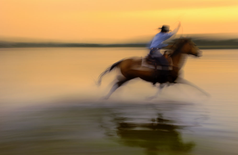 10 Tips for Better Camera PanningPerfecting the technique of panning to show motion
Featuring DAVE BLACK Recap: Panning EssentialsSPEED. Use slow shutter speeds to depict motion. How slow? Check Dave's choices in the file data, but experiment and practice to see what works best for you. SHARPNESS. Something—almost anything—in the photo should be sharp; more than one element doesn't hurt. Blur means motion, but all blur might be interpreted as a mistake. FLASH. Using your Speedlight guarantees a point of sharpness. Use it with rear curtain sync for a dramatic depiction of motion. FOCUS. Dave likes to lock focus on a zone through which his subject will pass, or use continuous servo autofocus when his subject or subjects are moving in unpredictable ways—but it's best to experiment with all focus methods to find your comfort zone. STEADINESS. If there's a predictable path for your subject, a tripod's a good choice. When there's random or unpredictable movement, hand-held is the way to go. Practice to perfect steady, smooth moves. DISTANCE. Subjects far away will appear to be moving more slowly than those close up, thus making them easier to pan with. The closer your subject is to the background, the greater the visual sensation of speed. VR. Use it. PREPARATION. Practice on easy subjects to get started: cars on the road, joggers, skateboarders, bike riders, your dog chasing a ball. It's the best way to determine the shutter speeds, focusing method(s) and pan movement that will do the job for you. |
Cathy Eaton
English Professor, fiction writer, photographer, kayaker, yoga, pilates, cross country skier Archives
November 2017
Categories |
||||
 RSS Feed
